Role
UX Designer
Industry
Strategy, UX Design
Years
2011 - 2015
Ultrabooks Landing Page
Challenge
When Ultrabooks became a category of laptops, Dell needed a category landing page to showcase their line up.
Brainstorm / Internal Testing
This new category of laptop was a unique selling point the rest of our product family did not currently present: it was not for the user who needed a powerhouse system to power heavy-duty software, this was for the on-the-go sales professionals, presenters, and home customers who wanted to have a family laptop that was powerful enough to browse the web, shop, and do basic tasks. After surveying a few individuals from each category, we began to understand the unique selling point for each user.

Design
Knowing this was a category of products that were ultra-thin, ultra-light class of laptops, we knew we would need clear direction to the customer to categorize them between the Inspiron, XPS, and convertible laptops and their differences. While one was great for a home environment, another a powerhouse with top-of-the-line components that could fit within the system, and the convertible that went from tablet to laptop with a quick flick of the wrist, we knew we needed to have the ability to compare the different systems quickly for the customer to find the one they needed.
In addition, Windows 10 was just launching. The added new OS on these thin laptops needed a bit extra communication.
We also knew the average customer would not understand the word "ultrabook" so clarifying what classified this system as one was important to define. These were unique and had to pass certain criteria to be classified as one. The benefit of having a powerful system so thin was the new thing that had to be highlighted.
And of course, you cannot forget the upsells to finish out the story and increase average order value.
Cloud Products Landing Page
Challenge
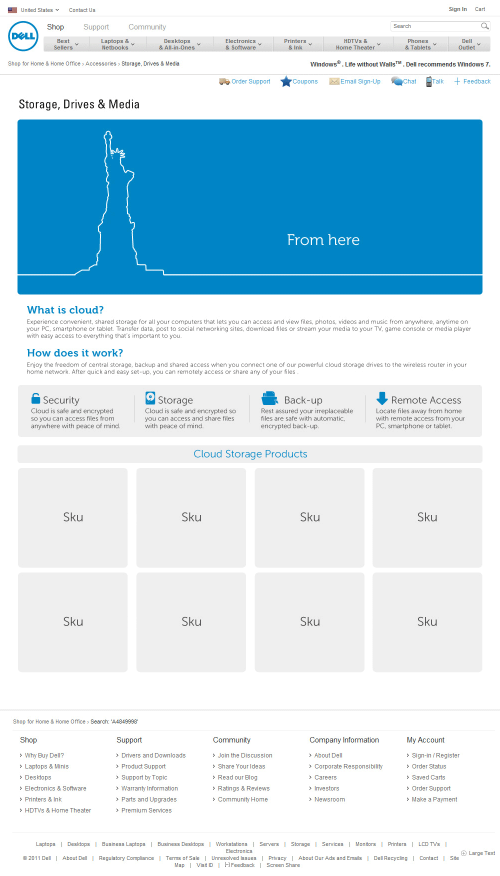
Believe it or not, there was a time where cloud was a foreign concept and hesitation was an emotion frequently used when mentioned. Dell was offering products to make your own cloud environment for home or business and we needed to explain and ease the woes of creating your own.
Brainstorm
Cloud was a weird idea back then. No one really knew what it was and to be honest, the team briefing was not even quite know what it was or what it did. It was an abstract idea of being able to access anything you needed from anywhere in the world. It was new. How do you explain that to the customer? Buy these items so you can access all of your files, from anywhere. It seems so simple and clear now, but then, it was not. We had to convey this idea in a way that would simplify and seem approachable, useful, and relevant to our customers.
Once we grasped the concept better ourselves, we brainstormed and identified the top reasons our customers would need to use this new technology. The world was becoming smaller, and at any given time, having access to your presentations, documents, technology while visiting clients or expanding your business was the crucial next step as a business to keep up with the ever-changing landscape.
Design
How do you approach something that has a ton of skepticism towards it? Create an approachable and simple animation that explains it in an easy-to understand way. This was a very fun project. I designed and created the full animation in Flash, the premium technology at the time. The animation followed a line that drew the depiction of cloud: from here to there displaying our iconic statue of liberty to various iconic world monuments followed by icons portraying multiple different file formats ending with a zoomed out map of the world displaying a home with an animated music note to a use depicted on the other side of the world. It didn't seem like such an abstract concept when you showed it in such a simple animation. But in case you were still confused, we provided additional information followed by all the products that allowed you to create your own cloud system.
XPS Teaser Landing Page
Challenge
Dell always loved to tease the newest system launch. The shiny new XPS 13 laptop was no exception, especially being their first venture into the ultrabook category.
Brainstorm
Since this was the very first Dell ultrabook, a new buzz category within the laptop world indicating a predetermined qualification of specs including battery and overall size, we wanted to make this feel sleeker than the rest of Dell's current site to showcase the premium new computer. We also knew this was a customer that coveted higher-price point premium design. Using other premium computer and high-end product companies as research and inspiration, we sketched and brainstormed a few ideas. Do we show the full product since this is a teaser or do we be flirty and show the thinness? Do we go into full detail or allow them to be excited about the lack of information? Do we add animation and hotspots to highlight key features? All these questions and more were considered as we explored our first venture into this premium category.
Design
To build hype, we created an interactive teaser landing page that showcased some of the new design features that made the system unique with the ability to sign up for notifications when the system would launch. The laptop was never full visible to keep an illusion of mystery while calling out individual specs.
Connected Home Landing Page
Challenge
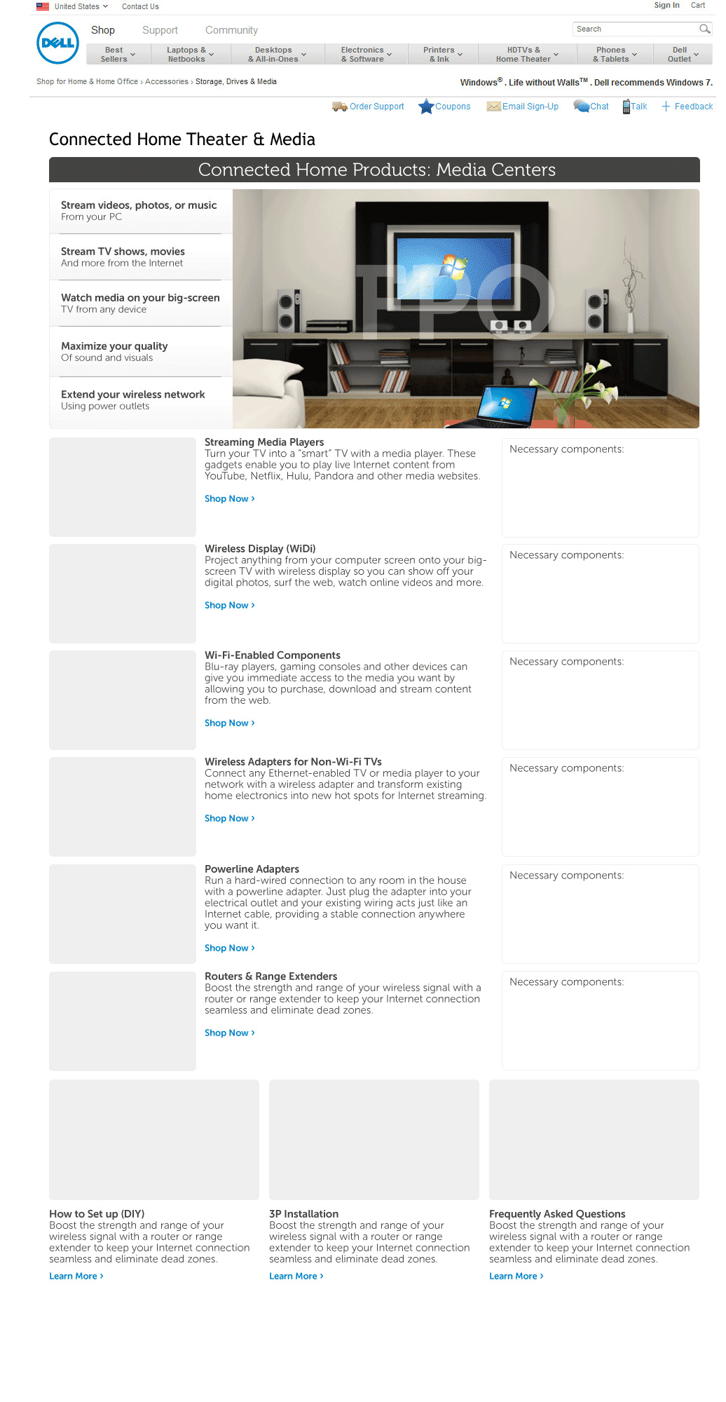
Dell sells a lot of peripherals outside of computers. One member of the team approached me with a request to showcase how all of the multiple products we sell, such as TVs, sound systems, computers, all interacted with each other to create your perfect home setup.
Brainstorm
While customers did know we sold other products outside of computers, proven by monitors being one of the best selling products, home electronics were not as commonly purchased. In order to broaden the customer mindset that we sold these types of products, we wanted to provide an ecosystem of the products we offered to showcase how to pair multiple in an environment that was relevant to our customer. After initial research of the top reasons customers would use our peripherals, we came with the initial ecosystems we wanted to promote. Working with the merchandising team, we paired all the products together. The next challenge was to source photography to depict all the items together in one place. Once all the initial pieces came into place, we then began wireframing. How could we make this engaging, showcase all the products you can purchase easily, and make it easy for the customer to purchase them all? These were the considerations we had to solve for.
Design
We knew we needed to showcase how all products could create your perfect ecosystem. Displaying a few environments with all the products working together seemed like the most straight-forward story. Adding interactivity with hot spots offered the users the ability to click on to learn more and purchase the product pictured in the room, making it also easier to quickly see all the products that could be purchased from Dell.com. Hotspots and interactivity in this way was a unique feature at the time so the challenge to develop and execute right was the challenge. After all the hard work, the page came together beautifully with easy-use-use hotspots and shoppability.